
Intro to Typography – Lettering Basics Lesson Plan (Lesson 1)
 Typography and graphic design lettering styles play a major role in the area of visual communication and graphic design.

I LOVE fonts and drive the IT guy nuts at my school because I’m always asking to install more fonts on my computer. Lettering styles can communication emotion and personality, they can be very powerful! This is the first part of a two part lesson on lettering as an art form.
IO: Learn the basics of letter formation. Learn and identify parts of a letter (anatomy of a letter). Understand that text style is important part of visual communication and that formats are varied to convey different messages.

Day 1
Delivery: The Language of Lettering
- Typography is the design and use of typefaces as a means of communication.
- Typography began with the first printing press-the Gutenberg, but really has its roots in hand-lettering (Calligraphy, Illuminated text, etc.).
- Lettering or typography is a very important part of visual communication. Fonts can communicate strength, power, emotion and personality. Think of some company logos that are just a typeface (Coke, Fender, Canon, etc.) What color are they? What does the construction of the typeface communicate about the company?
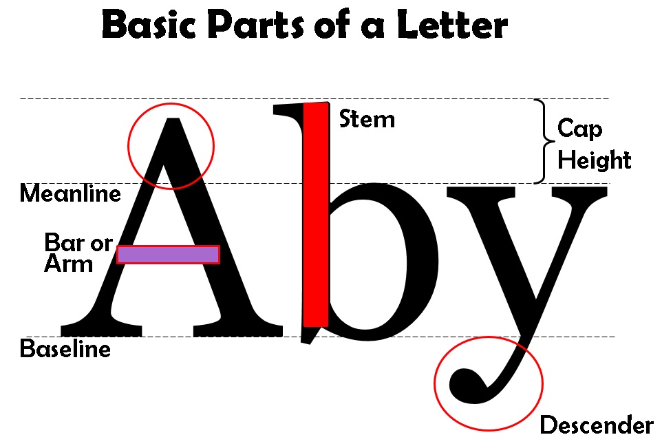
- Parts of a Letter:
- Basic list: Letter Anatomy by Eric Miller -excellent information!
- Baseline: the invisible bottom line on which characters sit.
- Meanline: the middle line that is at the top of most lowercase letters such as “o,” “p” and “r.” It is also at the curve of letters like “h.”
- Cap Height: the distance from the baseline to the top of uppercase letters like “B” and “H.”
- Ascender: The part of a character that extends above the meanline.
- Descender: The part of a character that extends below the baseline, such as the bottom stroke of a “g.”
- Stem: The stem is often the main “body” of a letter. The vertical line of a “B” and the primary diagonal line of a “V”.
- Crossbar or Arms: Bars are horizontal or diagonal lines of a letter, also known as arms, and are open on at least one side. “E” or “T”
- Basic list: Letter Anatomy by Eric Miller -excellent information!
 Serifs, Cases & Styles of Lettering
- Serifs: Fonts areoftendividedintoserifandsans serif.
- Serif fonts are distinguishable by the extra decorative line (style endings) at the ends of the character (examples of serif fonts are Times Roman and Georgia )
- Sans serif do not have the extra decorative lines. (examples of sans serif fonts are Arial and Impact )
- There are 3 “cases” in lettering: UPPER, lower and Mixed
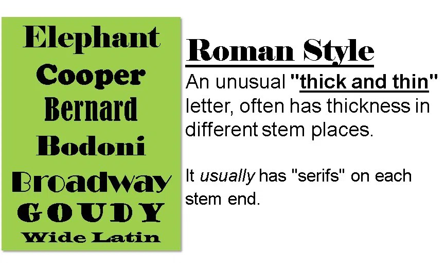
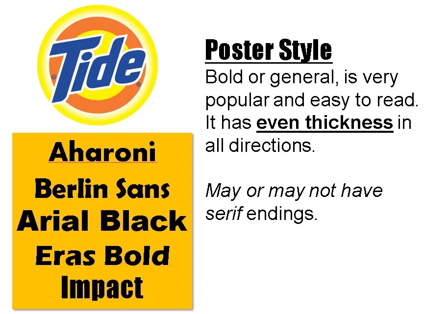
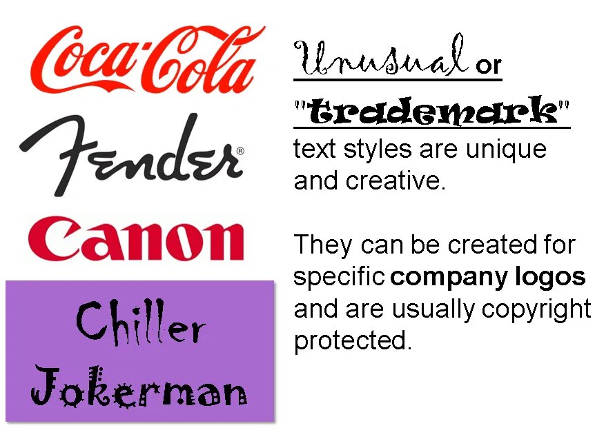
- 4 Main Styles of Lettering:
- Roman Style, a “thick and thin” letter, often has thickness in different stem places. It usually has “serifs” on each stem end.
- Poster Style, bold or general, is very popular and easy to read. It has even thickness in all directions and may or may not have serif endings.
- Script is a “connected” letter style, can be thick and thin or even thickness. It usually is “italic” or slanted. It is a very graceful, decorative style.

- Unusual or “trademark” text styles are unique and creative. They can be created for specific company logos and are usually copyright protected.
Activity: Typography Lettering Basics Worksheet

Lesson 2: Demuth 5 Style – Lettering as an Art form
Here’s a preview of the project:

If you choose to use any of this lesson (written or photos), please link back to this blog Create Art with ME!
I Love Typography » Blog Archive This Month in Typography …


)